Windows user interface settings.
Feb. 23rd, 2024 04:04 pmGetting my laptop replaced -- again -- has reminded me of the two most irritating Microsoft Windows user interface settings, which have moved -- again -- in revisions of Windows 10. It took me quite a while to find them this time. So, here's a helpful hint that may benefit you, dear reader.
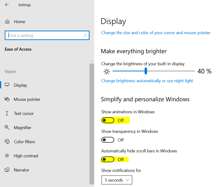
These settings are now (currently?) in the Ease of Access pane, which you can get to in Settings from just above your Start menu at bottom left of the screen.
Turning off animations in Windows disables, among other things, the sliding cursor effect as a letter is too-slowly drawn onscreen in Word and elsewhere. I find that this animation disruptive, as I look at the screen and the slow glide-and-reveal messes with my concentration, touchtyping speed and accuracy. It's even worse to watch this animation on someone else's screen. Removing e.g. the sliding new-cell animations from Excel is a bonus; Excel should not be a video game.
Turning on showing scrollbars so that you always know when there's content just outside the window or offscreen is very good to do, and there are e.g. a whole bunch of settings in Settings that I don't even think to look for unless I see a scrollbar to hint that there's more to discover. Having to hover a mouse everywhere to try and find out if there might be a scrollbar and extra content under the visible window is cognitive load I can well do without; it's no longer discoverability, but deception.
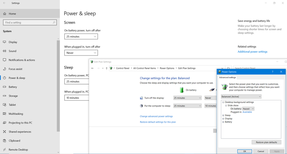
Finally putting these controls directly in a Settings pane is arguably an overdue improvement from them being in a Windows-XP-era control panel that is accessed from an 'Advanced settings' link in a Windows-7-era control panel that is accessed from an 'Additional settings' link in a Windows 10 settings pane. It's always interesting to see where Microsoft prioritises its time and money to slowly update the Windows user interface. An example of this decades-old nesting archaeology is from Power Options, which remains a joy to configure on a new machine -- and which strongly suggests that easy control of laptop power is not a priority for Microsoft.
I wouldn't be the first to suggest that Microsoft is poor at user interface design, and I surely won't be the last.
These settings are now (currently?) in the Ease of Access pane, which you can get to in Settings from just above your Start menu at bottom left of the screen.
Turning off animations in Windows disables, among other things, the sliding cursor effect as a letter is too-slowly drawn onscreen in Word and elsewhere. I find that this animation disruptive, as I look at the screen and the slow glide-and-reveal messes with my concentration, touchtyping speed and accuracy. It's even worse to watch this animation on someone else's screen. Removing e.g. the sliding new-cell animations from Excel is a bonus; Excel should not be a video game.
Turning on showing scrollbars so that you always know when there's content just outside the window or offscreen is very good to do, and there are e.g. a whole bunch of settings in Settings that I don't even think to look for unless I see a scrollbar to hint that there's more to discover. Having to hover a mouse everywhere to try and find out if there might be a scrollbar and extra content under the visible window is cognitive load I can well do without; it's no longer discoverability, but deception.
Finally putting these controls directly in a Settings pane is arguably an overdue improvement from them being in a Windows-XP-era control panel that is accessed from an 'Advanced settings' link in a Windows-7-era control panel that is accessed from an 'Additional settings' link in a Windows 10 settings pane. It's always interesting to see where Microsoft prioritises its time and money to slowly update the Windows user interface. An example of this decades-old nesting archaeology is from Power Options, which remains a joy to configure on a new machine -- and which strongly suggests that easy control of laptop power is not a priority for Microsoft.
I wouldn't be the first to suggest that Microsoft is poor at user interface design, and I surely won't be the last.
 |
 |